The murpworks logo is continually evolving. It reflects what we are thinking and what we are currently doing. Here's a secret history...
![]()
The First One
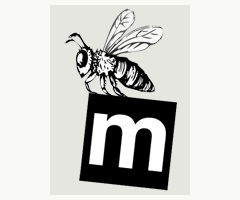
The first mLogo had the m, in a box being carried off by a bee. The bee was an ode the The Green Orchard - a poem that became a website. The trouble with The Green Orchard is that everybody was using the name. There was a bed & breakfast place, a Japanese restaurant, a graphic design company, the list was growing by the minute! So, we decided to come up with something new and that something new was murpworks. The m is Helvetica, simple and utilitarian. The m is in a box, constrained. We are all constrained by many and all things in life. Turn that constraint into an advantage. The bee because we are as busy as bees. The bees lived in a hive in the orchard and we grew from there.
The Animated One
'and the bee flew away with the m'
![]()
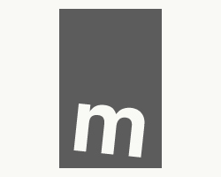
The Standard One
The black & white standard logo cropped for a new main webpage. Very corporate.
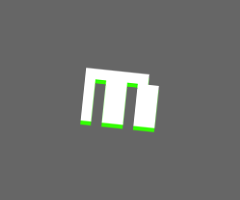
The Grey One
Moving to grey from black was a subtle change but helped key the logo into the webpage background colour change. Still quite corporate. The grey is #5c5c5c.
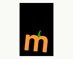
The Halloween One
Classic Halloween - orange and black with a hint of green to complete the pumpkin look.
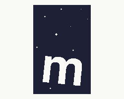
The Space One
Floating in pixel space - in honour of MEET ME AT THE JUMP GATE webcomic (early concept).
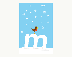
The Christmas Ones
A 2015 Advent calendar of 24 m's - it was a tall order creating a continuous stream, one after another, day by day, around a single theme but we managed it. In fact we enjoyed it so much, we may try it again one year. The robin was #3.
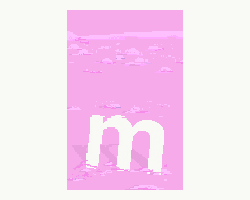
The Alien Planet One
The pink alien planet features in the webcomic - MEET ME AT THE JUMP GATE. This m was created in support of the webcomic and brought in a bit of colour.
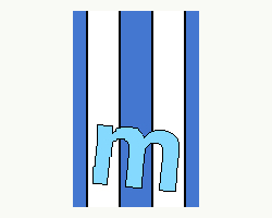
The Stripey One
The stripes evoke a deckchair and the seaside. Used to support Beside The Seaside - a seaside side-scroller computer game. #1 of 4.
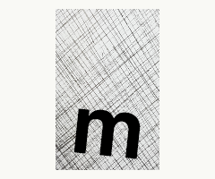
The Hatched One
The hatching take us into the world of art. Fine art - damned fine art!.
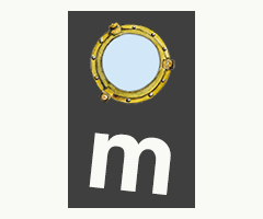
The Porthole One
The porthole was in honour of bringing Nb MIRRLESS back from Northampton to the Kennet & Avon canal. It was an adventurous journey but we made it!
The Light Grey One
The light grey one - #cccccc brought a more muted feel to the website. It was continued with the 'murpworks' text in the same colour. The logo also became square.
![]()
The pixel grey One
The pixel grey one - We've moved over to a new font to support the pixel aesthetic.
![]()
The pixel pale blue One
The pixel pale blue one - for the return of Beside the Seaside - a pixel art game.
![]()
The pixel Halloween 2020 One
The pixel Halloween 2020 one - A simple pumpkin feel.